Meteor CraterWebsite, 3D, Ticketing02 / 05
A sense of adventure.A simpler path to visit.
Bringing Meteor Crater’s new identity to life through exploration, clear planning, and connected ticketing.
The redesigned web experience, from discovery to planning a visit.
A remarkable place.
A visit to make simpler.
Meteor Crater needed a web experience that matched its rebrand and helped people plan a visit. The audience ranged from older bus-tour groups to Route 66 travelers, camping families, and passing drivers reached through outdoor advertising. Most visited on a phone.
Working with Gary Tarr at Free Range Productions, I led the web experience from planning through design and build. The brief connected the landmark and its RV park: two ways to arrive, with the crater as the destination.
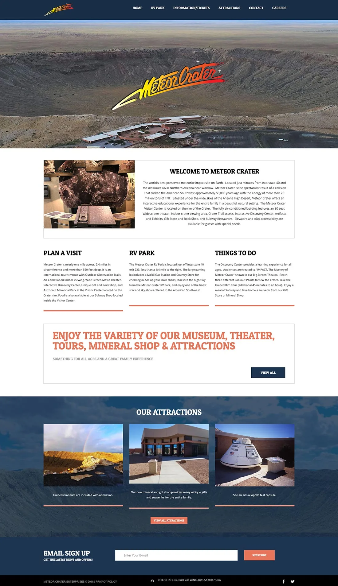
Make the visit easier to see.
The previous homepage asked visitors to read through the offer. The redesign needed to make the experience and the next step clear at a glance.
Three priorities shaped the work.
Start with the questions
that shape a visit.
I separated pre-visit planning from onsite exploration. “Plan Your Visit” handles the practical details; “Attractions” shows what there is to experience. The RV park gives campers a place to stay and a path to the landmark.
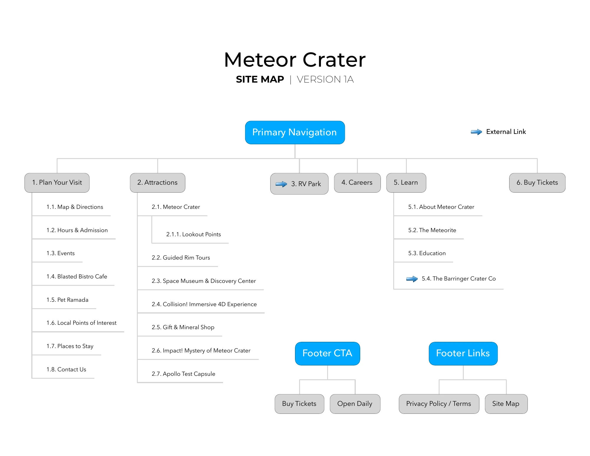
Planning and attractions form the two main branches. Tickets appear in both the navigation and footer. View original PDF (opens in a new tab)

One section.
One idea.
Duration and quick attraction tags answer frequently asked questions first. Short sections follow, each with a single paragraph, so visitors can understand the experience at a glance.
Bring out
the explorer.
I made the crater the central scene: a place to explore through 3D graphics and interactive hotspots. The concept copy welcomed “adventurers and space enthusiasts,” with a playful, family-oriented voice throughout.


The initial design established the direction. I simplified it for loading and performance, balancing the richness of the scene with the speed of the experience.
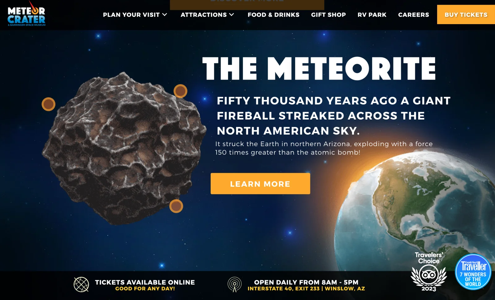
The meteorite becomes an object to explore, with short copy alongside it and tickets still in view.
Keep the next step
within reach.
With most visitors on phones, I designed a bottom dock for quick ticket access and one-handed navigation. Reduced motion kept the mobile experience focused on exploring the destination and planning a visit.
Tickets and essential visitor actions stay at the bottom of the screen.
Rebuild the path
from interest to admission.
The previous vendor’s WooCommerce setup left ticketing dependent on their system. I reverse-engineered the purchase flow, rebuilt the ticketing function, and created the bridge to Meteor Crater’s CRM suite.

The experience extends
beyond checkout.
The work connected the visitor-facing purchase path with the client’s operational system. Ticketing was part of the product experience from the start.
The staff-facing ticket lookup and scanning interface.
A new identity.
A complete visitor experience.
The redesign brought discovery, visit planning, and ticketing into one experience. Alongside the site, I created the 3D graphics and rebrand animatic to introduce the new identity.
Hashtag prompts encouraged visitors to share their own experiences, bringing social proof into the site and extending the story beyond the visit.
The animatic created to introduce Meteor Crater’s new identity.