Lowell ObservatoryWebsite, Wayfinder01 / 05
A world of discovery.One connected experience.
Bringing the science, the stories, and the practical details of a night on Mars Hill into one digital experience.
A first glimpse of the cosmos, followed by the details that make a visit possible.
One institution.
Several disconnected worlds.
Visitors knew they could look through a telescope. The harder question was what else they could do once they arrived: see a live show, tour a historic dome, explore an exhibit, join a class, attend a talk, or simply find their way around the hill.
The public website, research, and foundation lived across separate sites. The same offerings were described as “Things to Do,” “Experiences,” or “Telescopes & Exhibits,” while researchers, educators, and members entered through separate audience paths. With nearly every story built from one generic page type, both discovery and publishing depended on people understanding Lowell’s internal boundaries.
From separate destinations to a shared foundation
Previous structure
Research, education, membership, and public programs crossed paths without sharing one clear definition.
Proposed direction
Content connects around people’s intentions.
The legacy navigation mixed institutional sections, audience entrances, and overlapping names for onsite activities. The proposed direction reorganized the same breadth around four clear visitor intentions.
Three priorities shaped the work.
Connect the
content.
Bring scattered offerings into one shared model, so teams publish once and visitors discover more.
Make the visit
clear.
Keep hours, schedules, and tickets close to the experiences that spark curiosity.
Bring the campus
closer.
Connect digital discovery to the hill itself, with landmarks, paths, and places to explore.
Design the relationships.
Then design the pages.
A building is not the same thing as the venue inside it. A venue is not the same thing as the show on its schedule. Defining those relationships made Lowell’s full offer legible without flattening everything into another page.
The model connected campus buildings, venues, experience types, and individual experiences. Editors could update one record; visitors could meet it through the homepage, a filtered archive, a venue, the campus map, or a planning page.
One experience. Many useful connections.
- Campus buildingAstronomy Discovery CenterWhere visitors arrive
- VenueLowell Universe TheaterA place inside the building
- Experience typeShows & theaterA filterable service definition
- ExperienceMeet the PlanetsStory, schedule, price, location, ticket path
The hierarchy turns an offering into structured, reusable content: building → venue → experience type → experience.
A front door for every kind of curiosity
Visit
Plan
- Plan your visit
- Tickets
- Campus map
- Hours & events
Experiences
- Telescope viewing
- Universe Theater
- Dark Sky Planetarium
- Classes & excursions
Groups
- Field trips
- Camps
- Weddings
- Venue rentals
Learn
About Lowell
- Mission & history
- Historic timeline
- Dark skies
- Lunar legacy
Digital content
- Blog
- Star Stuff podcast
- Virtual exhibits
- Space image gallery
Research
Our science
- Areas of research
- Our scientists
Research telescopes
- Lowell Discovery Telescope
- Anderson Mesa
Support
Giving
- Donate
- Ways to donate
- Programs to support
- Sponsors & partners
Membership
- About membership
- Become a member
- Renew membership
Get involved
- Volunteer
- Careers
- Contact philanthropy
Visit now owns planning and the complete onsite offer; Learn, Research, and Support each have a distinct purpose.
Let wonder lead.
Keep the next step close.
The homepage needed to do more than inspire a telescope visit. Curated experience channels reveal the full range of things to do, while hours, sunset, schedules, location, price, and ticket actions help people turn curiosity into a plan.
The guiding journey was simple: discover what is possible, understand what fits this visit, and find the next step without losing the sense of wonder that brought someone there.
Structure before surface
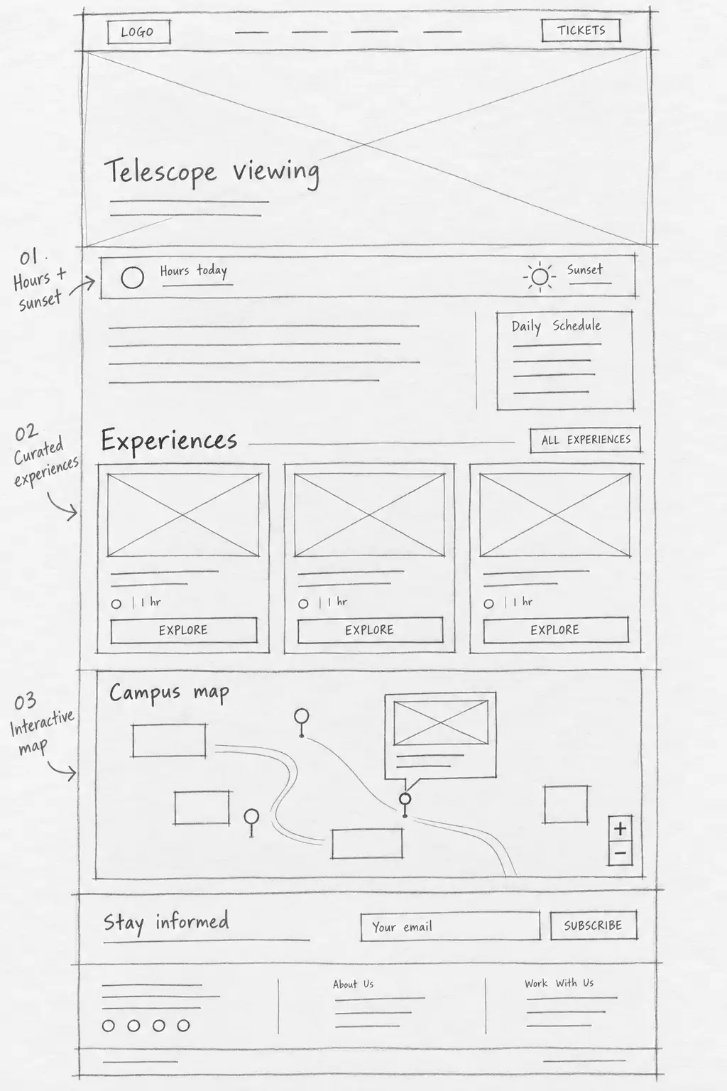
The first-round wireframe arranged the page around the questions that shape a real visit—not around Lowell’s departments.
- Know when to arrive.Hours, sunset, and the daily schedule share the opening context.
- See what else is possible.Curated experience cards broaden discovery beyond telescope viewing.
- Understand the place.The campus map connects each offering to a physical destination.
A working wireframe from the first design round. It shows the proposed hierarchy before the brand system and final interface were applied.
From “that looks incredible” to “let’s go”
- LOWELLVisit · Learn · ResearchA first glimpse of the night sky
Discover the experience
An inspiring introduction and a reason to explore.
Explore experiences 01 / Homepage - LOWELLVisit / ExperiencesThe telescope & its story
Picture yourself there
What to expectWhere to find itPlan your visit 02 / Experience page - LOWELLVisit / Tickets
Make a plan
Admission information, visit details, and a clear route to tickets.
General admissionExplore what’s includedView ticket options 03 / Tickets page
The journey connects discovery, context, and ticketing. Each step adds only the information needed to move from “what can I do?” to “how do I plan it?”


Give the experience room to tell its story, with practical information and a clear next action in the same journey. The page captures show the finished pages; the wireflow shows how they connect.
The visit starts online.
The discovery keeps going.
The campus map brings the physical destination into the digital experience. Paths, landmarks, and categories give visitors another way to understand what is on the hill.
Category filters and selected-location cards connect the illustrated campus to the places visitors can explore.
Orient
Show the campus as a connected place, with recognizable landmarks and paths.
Explore
Help people distinguish experiences and amenities through the map’s category controls.
Connect
Bring information about a place closer to its location on campus.
Many reasons to visit.
A consistent sense of place.
The same visual language carries very different stories: a child’s first week at camp, a scientist’s work, or a deeper relationship through membership. Light and dark components move between daytime planning and night-sky storytelling, while structured heroes, dynamic cards, calls to action, FAQs, hours, weather, and event modules give editors flexible parts without returning to an anything-goes page.


A clearer whole.
From content to campus.
The new structure makes Lowell’s breadth visible: telescope viewing sits beside shows, talks, tours, exhibits, classes, camps, events, research, and ways to support the institution. The experience connects that discovery to the practical details of a visit instead of making visitors assemble the plan themselves.
Behind the interface, defined content types and taxonomy create a shared publishing foundation. A single experience can be curated across navigation, archives, schedules, venues, and the campus map without rewriting the same facts in every place.
One navigation for visiting, learning, research, and support; filterable experience channels; practical visit information; and connected campus wayfinding.
Published experienceRelationships between buildings, venues, experience types, and individual experiences, supported by reusable page and component patterns.
Shared source of truth